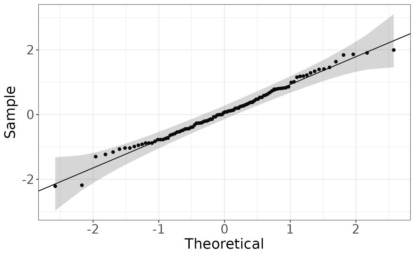
Plot data against a theoretical distribution. The typical comparision to a normal distribution is called a QQ-plot.
Usage
distribution_plot(
  x,
  distribution = "norm",
  alpha = 0.05,
  labels = names(x),
  ...
)
Arguments
- x
Vector of observations
- distribution
String of distribution as part of the 'qDIST' and 'dDIST'
- alpha
Numeric for the significance used for the bands. If it outside (0,1) or NULL then no bands will be computed
- labels
Vector of labels of the same length as
xfor the string to add to the plot when a value exceeds the bounds- ...
Additional parameters to pass to qDIST